Radiation Warning Signs
Radiation Warning Symbol (Trefoil)
Paul Frame, Oak Ridge Associated Universities
The radiation warning symbol should not be confused with the civil defense symbol designed to identify fallout shelters.
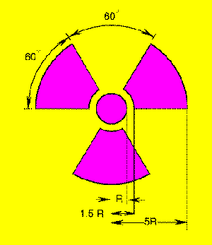
Radiation warning symbol
The civil defense symbol for a fallout shelter consists of a circle divided into six sections, three black and three yellow. The general form is very similar to the above however there is no central circle. The Office of Civil Defense originally intended fallout shelters to use the radiation warning symbol with the circle in the center and the three blades, but this idea was rejected because a fallout shelter represents safety whereas the radiation warning symbol represents a hazard.
The three-bladed radiation warning symbol, as we currently know it, was "doodled" out at the University of California Radiation Laboratory in Berkeley sometime in 1946 by a small group of people. This event was described in a letter written in 1952 by Nels Garden, head of the Health Chemistry Group at the Radiation Laboratory: "A number of people in the group took an interest in suggesting different motifs, and the one arousing the most interest was a design which was supposed to represent activity radiating from an atom."
The first signs printed at Berkeley had a magenta (Martin Senour Roman Violet No. 2225) symbol on a blue background. In an earlier letter written in 1948, Garden explained why this particular shade of magenta color was selected: "it was distinctive and did not conflict with any color code that we were familiar with. Another factor in its favor was its cost... The high cost will deter others from using this color promiscuously." Explaining the blue background, he said, "The use of a blue background was selected because there is very little blue color used in most of the areas where radioactive work would be carried out."
Garden did not like yellow as a background: "the very fact that... the high visibility yellow stands out most prominently has led to extensive use of this color and it is very common." To compensate for the lower visibility of the blue, Garden even toyed with the idea of including diagonal white stripes across the sign.
Despite Garden's view to the contrary, most workers felt that a blue background was a poor choice. Blue was not supposed to be used on warning signs, and it faded, especially outdoors. The use of yellow was standardized at Oak Ridge National Lab in early 1948. At that time, Bill Ray and George Warlick, both working for K.Z. Morgan, were given the task of coming up with a more suitable warning sign, a blue background being too unacceptable. Ray traveled to Berkeley and picked up a set of their signs. Back in Oak Ridge, Ray and Warlick had their graphics people cut out the magenta symbols and staple them on cards of different colors. Outdoors, and at a distance of 20 feet, a committee selected the magenta on yellow as the best combination.
All sorts of variations on the Berkeley design were suggested and implemented during the 1940s and early 1950s. Especially common were signs that incorporated straight or wavy arrows between, or inside, the propeller blades. By the late 50s, ANSI standards and federal regulations had codified the version of the warning sign used today. Present regulations also permit the use of black as a substitute for magenta. In fact, black on yellow is the most common color combination outside of the United States.
Might some previous design have inspired the radiation trefoil? Marshall Brucer suggested that this symbol was used at a naval dry dock near Berkeley to warn of spinning propellers. To me, the magenta symbol is striking similarity to a commercially available radiation warning sign, used before 1947, that consisted of a small red dot with four or five red lightning bolts radiating outwards, a design very similar to that on electrical hazard warning signs. The trefoil also has some resemblance to the Japanese battle flag which would have been familiar to folk on the west coast.
Whatever the inspiration, it was a good choice. It is simple, readily identifiable (i.e., not similar to other warning symbols), and discernible at a large distance.
The best single reference on this subject is "A Brief History of a 20th Century Danger Sign" by Stephens and Barrett that appeared in Health Physics Vol. 36 (May) pp. 565-571. This paper, together with additional material by Saul Harris, is reprinted in "Health Physics: A Backward Glance" by Kathren and Ziemer published by Pergamon Press, 1980.
Much of the material quoted in this article was graciously provided by Ron Kathren and George Warlick.
-
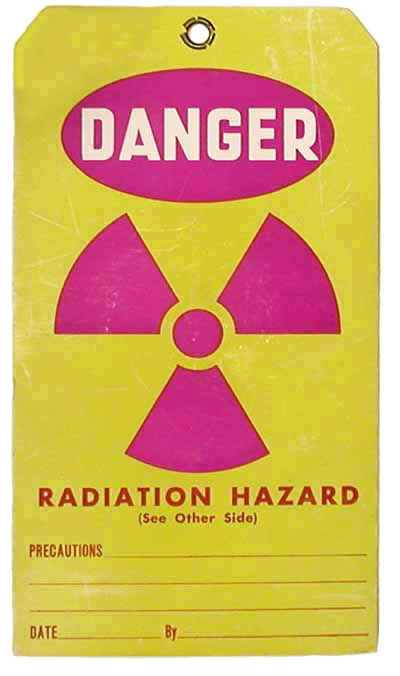
First Production Run of Trefoil Warning Sign with Yellow Background First Production Run of Trefoil Warning Sign with Yellow Background
-
Original Trefoil Warning Sign from Berkeley Original Trefoil Warning Sign from Berkeley
-
Original Trefoil Warning Sign from Berkeley Original Trefoil Warning Sign from Berkeley
-
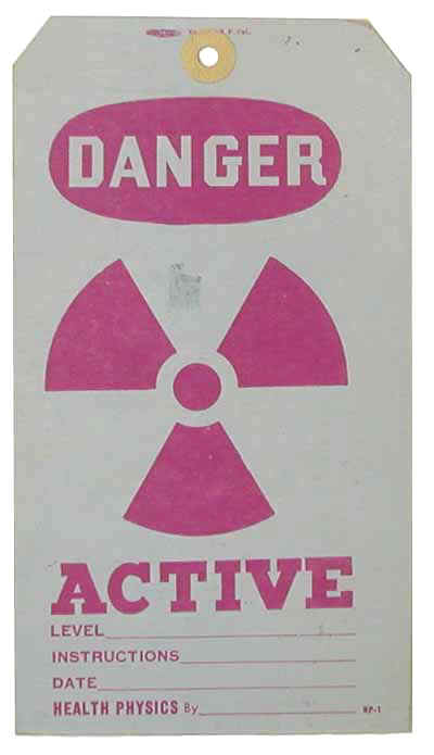
Prototype Trefoil Warning Sign with Yellow Background Prototype Trefoil Warning Sign with Yellow Background

-
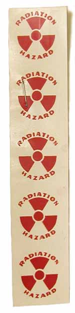
Radiation Warning Decals Radiation Warning Decals
-
Radiation Warning Sign (Pre-Trefoil) Radiation Warning Sign (Pre-Trefoil)

-
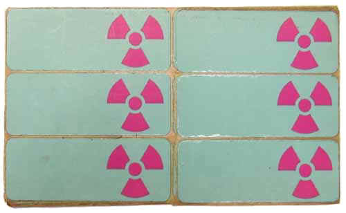
Radiation Warning Stickers Radiation Warning Stickers
-
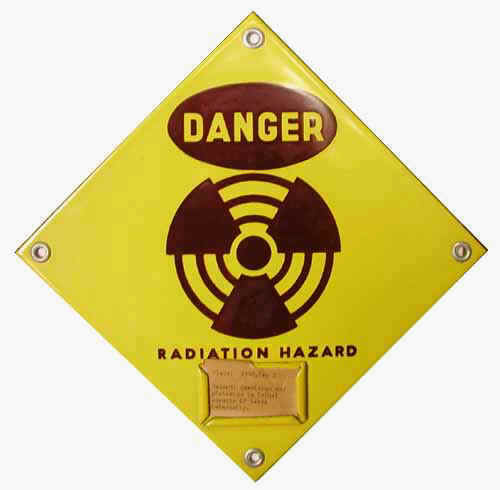
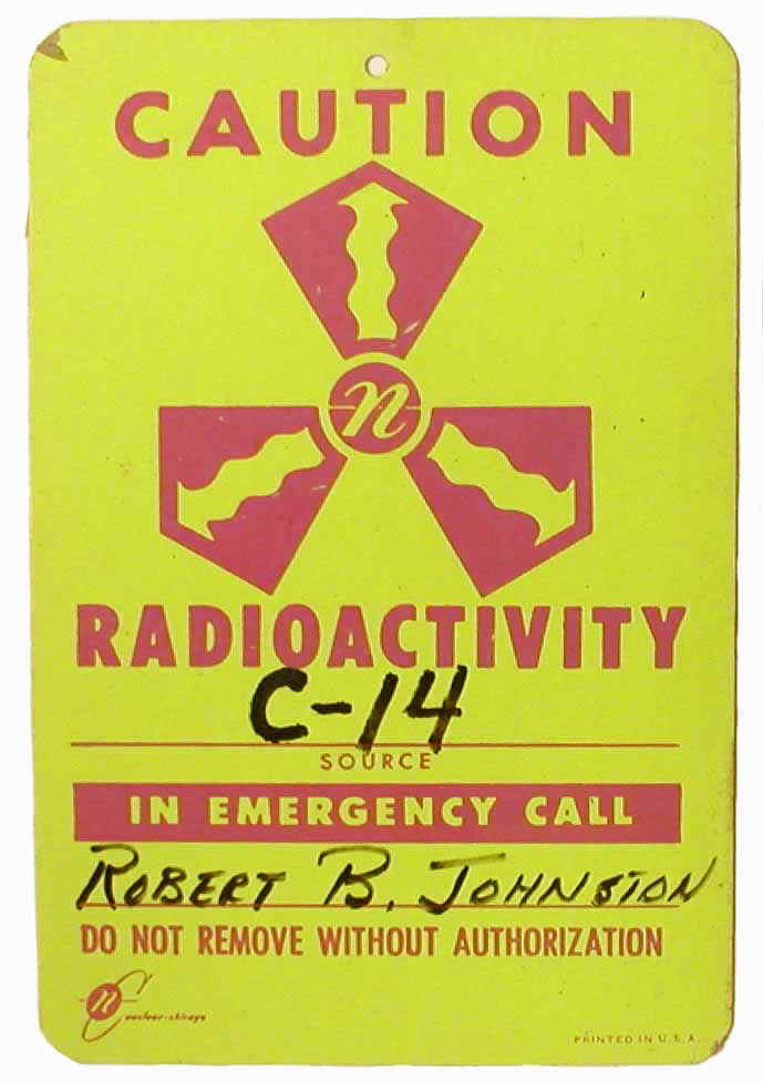
Special Radiation Hazard Warning Sign from ORNL Special Radiation Hazard Warning Sign from ORNL
-
Striped Variation of Trefoil Warning Sign Striped Variation of Trefoil Warning Sign
-
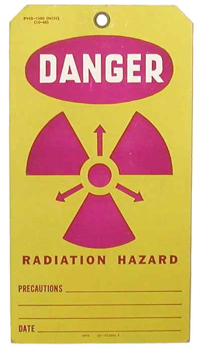
Trefoil Warning Sign with Straight Arrows between Blades Trefoil Warning Sign with Straight Arrows between Blades
-
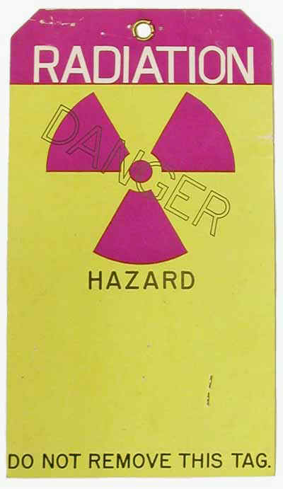
Trefoil Warning Sign with Wavy Arrows Inside Blades Trefoil Warning Sign with Wavy Arrows Inside Blades
-
Variation of Trefoil Warning Sign Variation of Trefoil Warning Sign
-
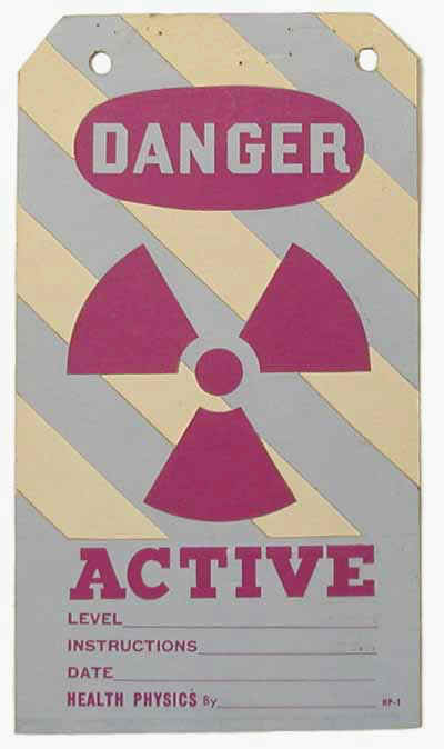
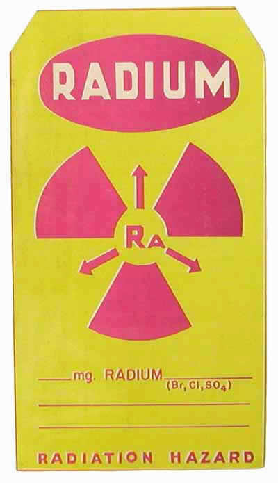
Warning Sign for Radium Sources Warning Sign for Radium Sources
Radiation Warning Signs
During World War II, a variety of different warning signs for radiation hazards. The trefoil hazard sign used today was developed by health physicists at Berkeley National Laboratory and Oak Ridge National Laboratory.